Application Design
2023
Jannik Aßfalg, Leon Burg, Jannes Daur,
Problem
The online store Hard Wax offers customers a simple platform for ordering vinyl records. It has garnered particular popularity among DJs in the electronic scene, due to its precise assortment of handpicked music.The website currently suffers in usability because of its unorganized content, difficult navigation and old fashioned aesthetic. Hard Wax has the potential for modernization and could benefit from an enhanced focus on the presentation of its offered content.


Idea
To intensify the user experience, a complete redesign of the website was necessary. Overall, the goal was to modernize and increase immersion, while staying faithful to the already established visual identity of Hard Wax.This includes a minimalistic aesthetic, simple core elements such as navigation and selected content. Functions such as the searching, filtering and purchasing were to be reinvented. Furthermore, an introduction of a new set of features would enhance the websites "Joy Of Use”.

Album of the Week
This page celebrates a curated album chosen by Hard Wax employees on a weekly basis. On this page, the individual tracks and the album cover are prominently highlighted.Search + Extended Player
The new search page allows for even more precise searching of tracks, albums, artists, and labels. In addition to an enhanced list view, there is now a tile view that can display the same album information through a hover state. With the help of the Extended Player, users have constant access to the queue and all songs and information of the currently played album. Moreover, experienced users can manipulate the track using the filter and BPM sliders and adjust the volume even more precisely.


Artist Discography
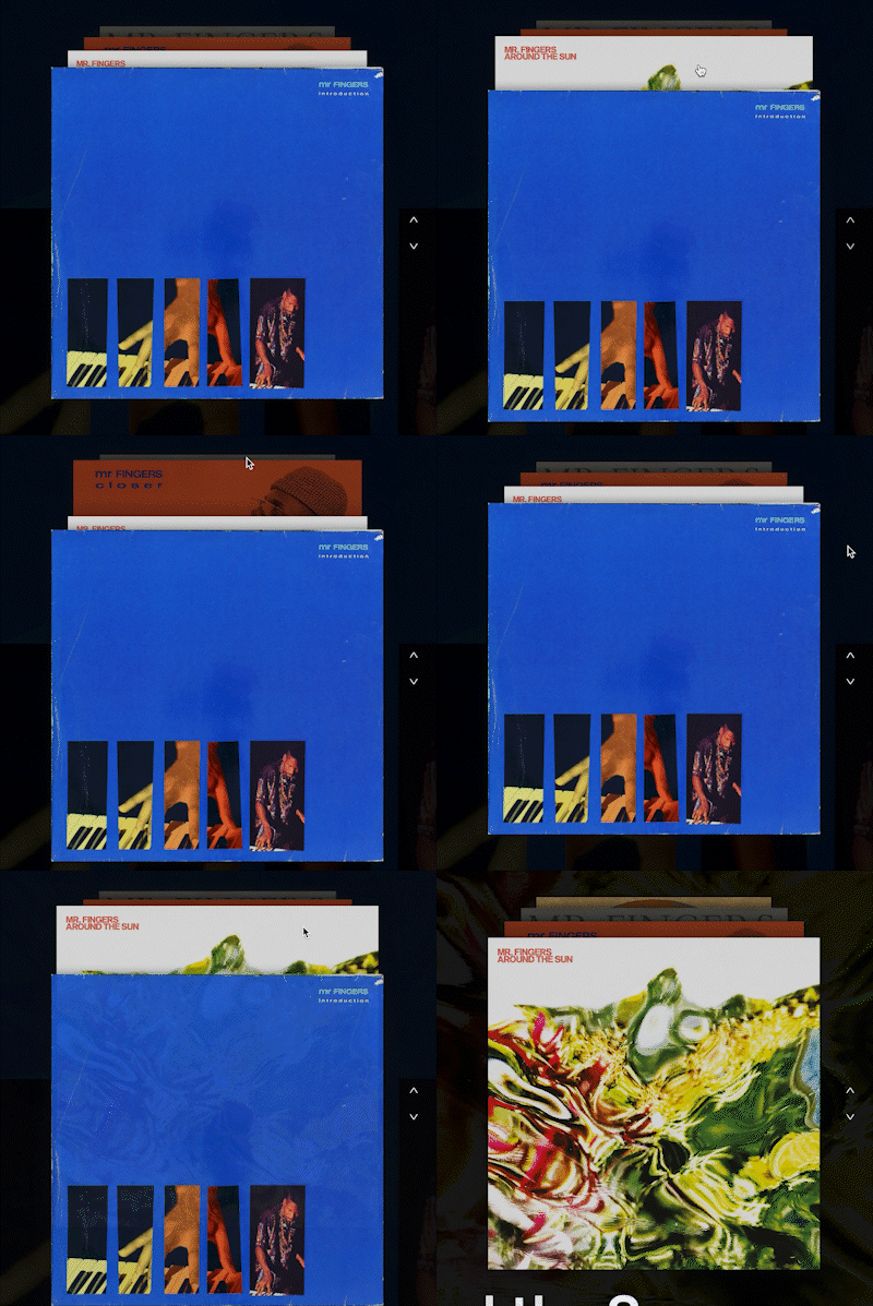
This page gives the user an overview of an artists discography, aiming to bring the buyer closer to the product they are buying. This feature also serves to promote the artist.


Solution
The resulting redesign of Hard Wax has a modern look, utilizing a grid system and a consistent style guide, defined by its colors, fonts, a new logo and an icon set specifically designed for the project. Additionally, UI elements such as the music player, button interactions and the header were rethought and overhauled.The introduction of an extended music player, the “Album of the Week” page and individual artist/label pages with corresponding discographies also benefit the websites usability. All of these features aim to bring the user more joy by creating an atmosphere that stays faithful to the experience in a real vinyl store.